
LABELBOX
VISUAL STORYTELLING
Role
Senior Brand Designer
Scope
Illustration
Editorial Design
Product Marketing
Brand
As Labelbox expanded its library of technical guides and white papers, each publication needed a distinct visual identity while still feeling unmistakably part of the brand. I developed a series of editorial illustrations that translated complex topics into simple visual metaphors, creating covers that were both informative and visually engaging.

The Challenge
Labelbox’s white papers covered increasingly complex and technical subjects, from model selection to data infrastructure and production workflows. These ideas needed to be communicated visually without relying on generic or overly literal technology imagery.
The challenge was to give each publication a distinct visual concept while maintaining enough consistency for the covers to feel like part of a cohesive collection.
Goals
Simplify complex topics
Translate technical concepts into approachable visual metaphors that could be understood at a glance.
Create distinct narratives
Give each publication its own visual idea rather than relying on repetitive or generic technology imagery.
Maintain brand consistency
Use a shared visual language of color, geometry, perspective, and illustration style to connect the collection.
Design for impact
Create covers that remained recognizable and engaging across PDFs, landing pages, social promotion, and other marketing touchpoints.
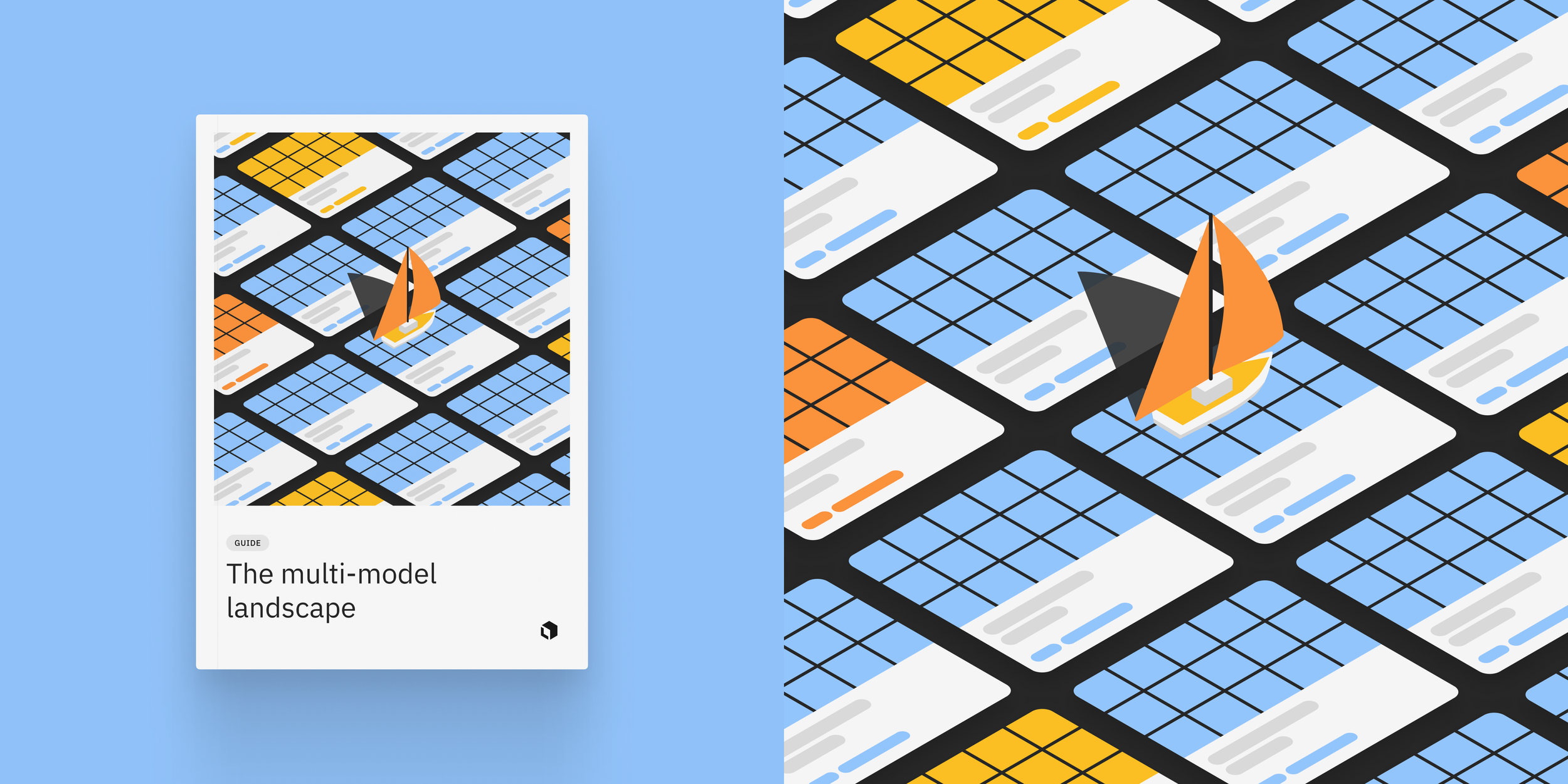
Navigating a Multi-Model World
A sailboat navigating a field of model cards transformed the growing number of model choices into a simple metaphor for finding the right path forward.
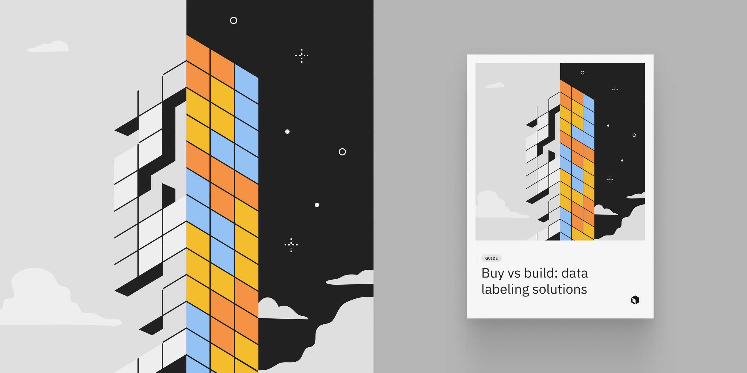
Buy vs. Build
Modular forms and contrasting environments highlight the choice between building an internal data labeling solution and buying an existing platform.

The Path to Production AI
Orbital paths and a rising rocket visualize the journey from experimentation to production, turning a complex development process into a clear sense of progress and momentum.
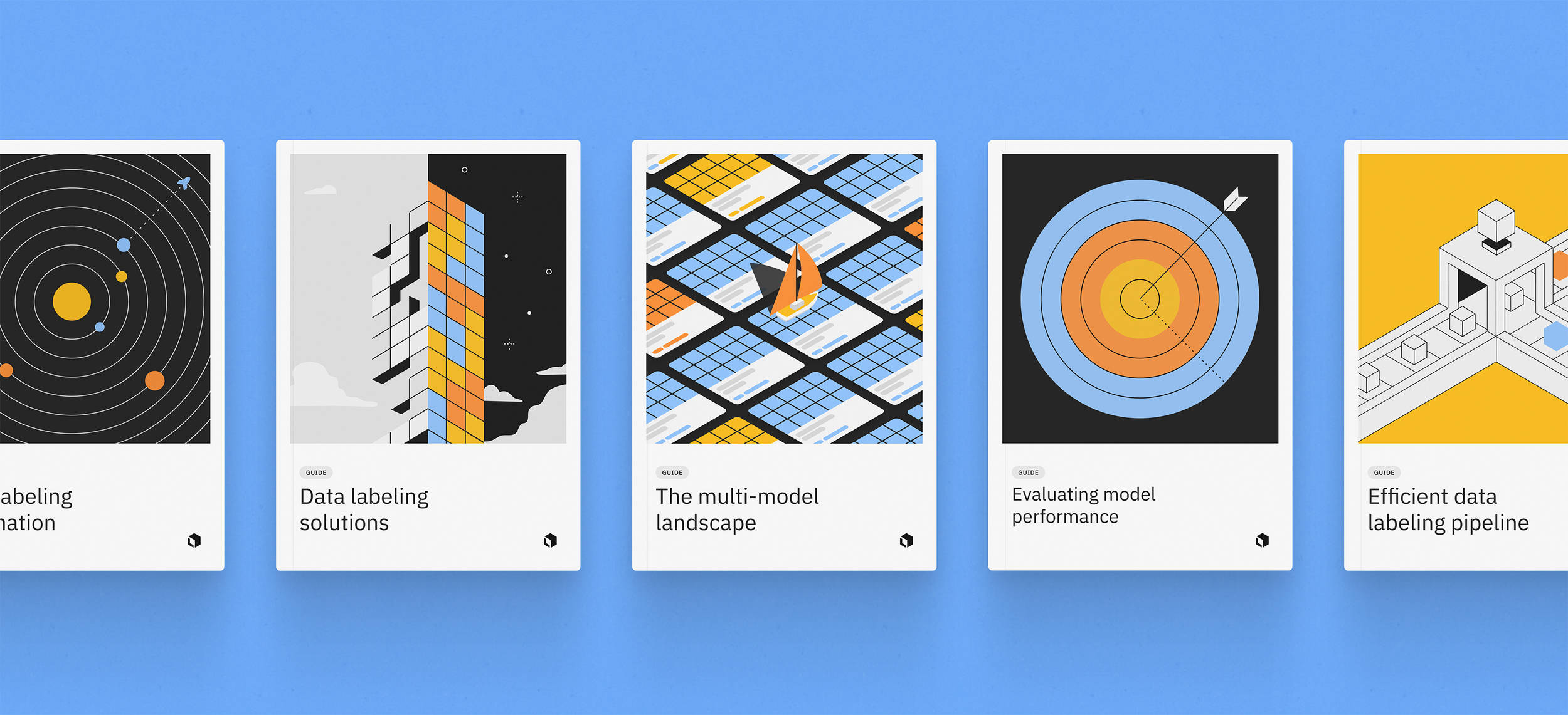
A Cohesive Collection
While each illustration was built around a different concept, a shared palette, geometric construction, and dimensional style connected the covers as a recognizable family.